Kaia Wallet Button Design Guide
Before we start
This manual introduces design rules for the Kaia Wallet App2App Button.
Although following this manual is preferred, you may modify the design based on the application’s own UI/UX design.
However, the design should be modified only within the range of examples shared in this manual.
Components and colors
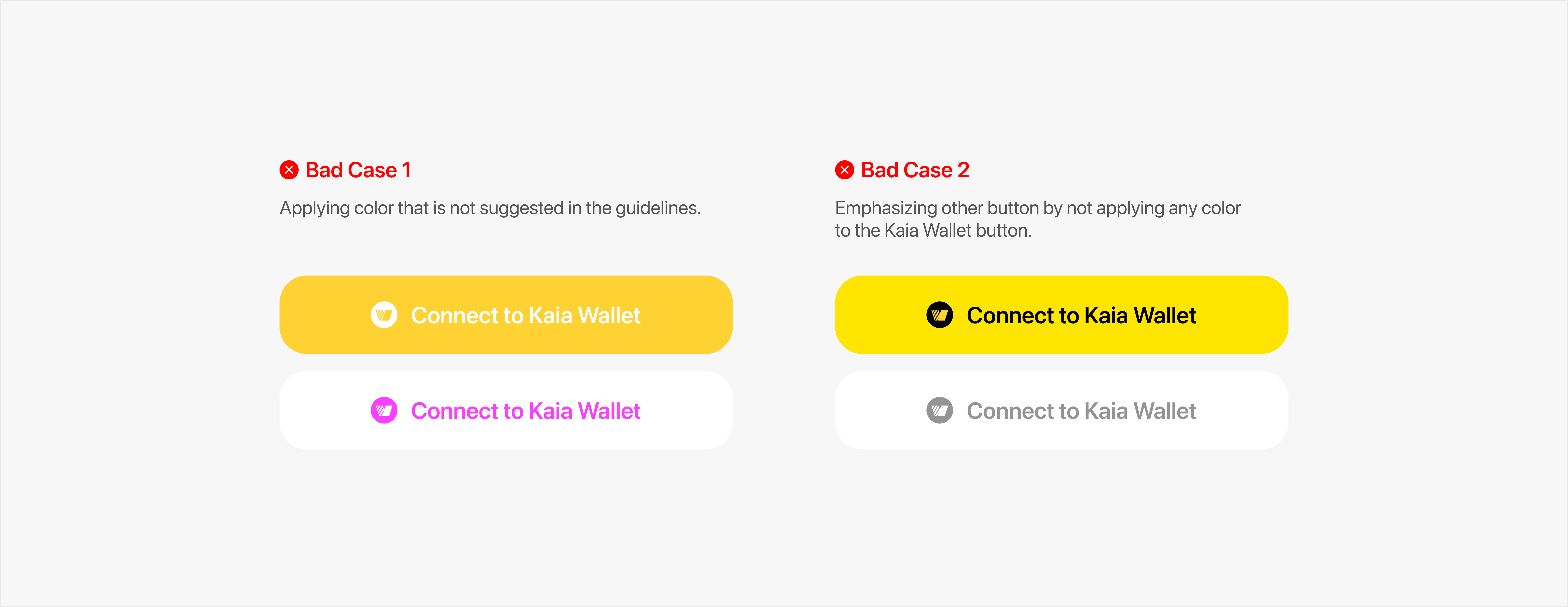
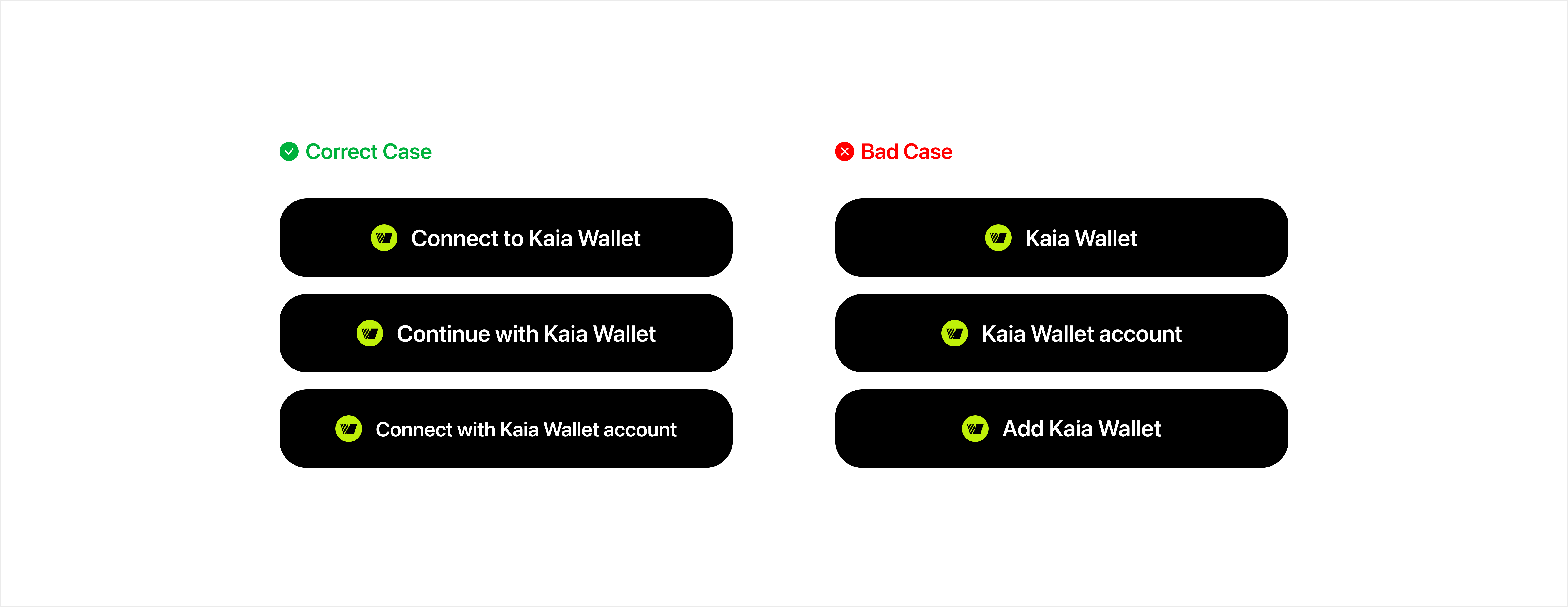
Connect to Kaia Wallet button has three components, each of which has its own distinct color defined below.
- Symbol that identifies Kaia Wallet :
 #BFF009
 - Label that introduces button’s job :
 #FFFFFF
 - Container that wraps symbol and label :
 #000000
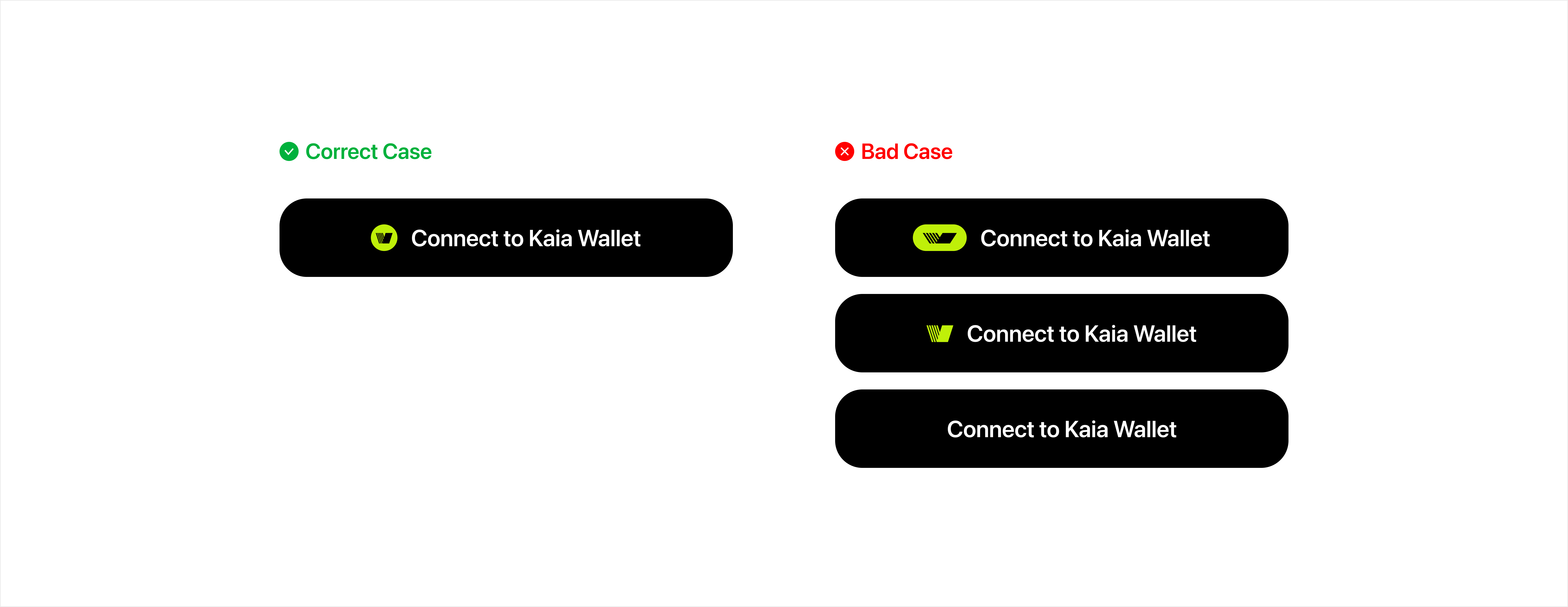
Symbol
- Should use the distinct symbol that defines Kaia Wallet
- Cannot arbitrarily change color, shape, or ratio of the symbol
- Cannot use other icons instead of the symbol
- Cannot build a button without the symbol
Label
Can use (Recommended)
- Log in / Sign in with Kaia Wallet
- Connect with Kaia Wallet account
Can use (If necessary)
- Log in / Sign in with Kaia Wallet
- Log in / Sign in with Kaia Wallet account
- Log in / Sign in with Kaia account Wallet
Container
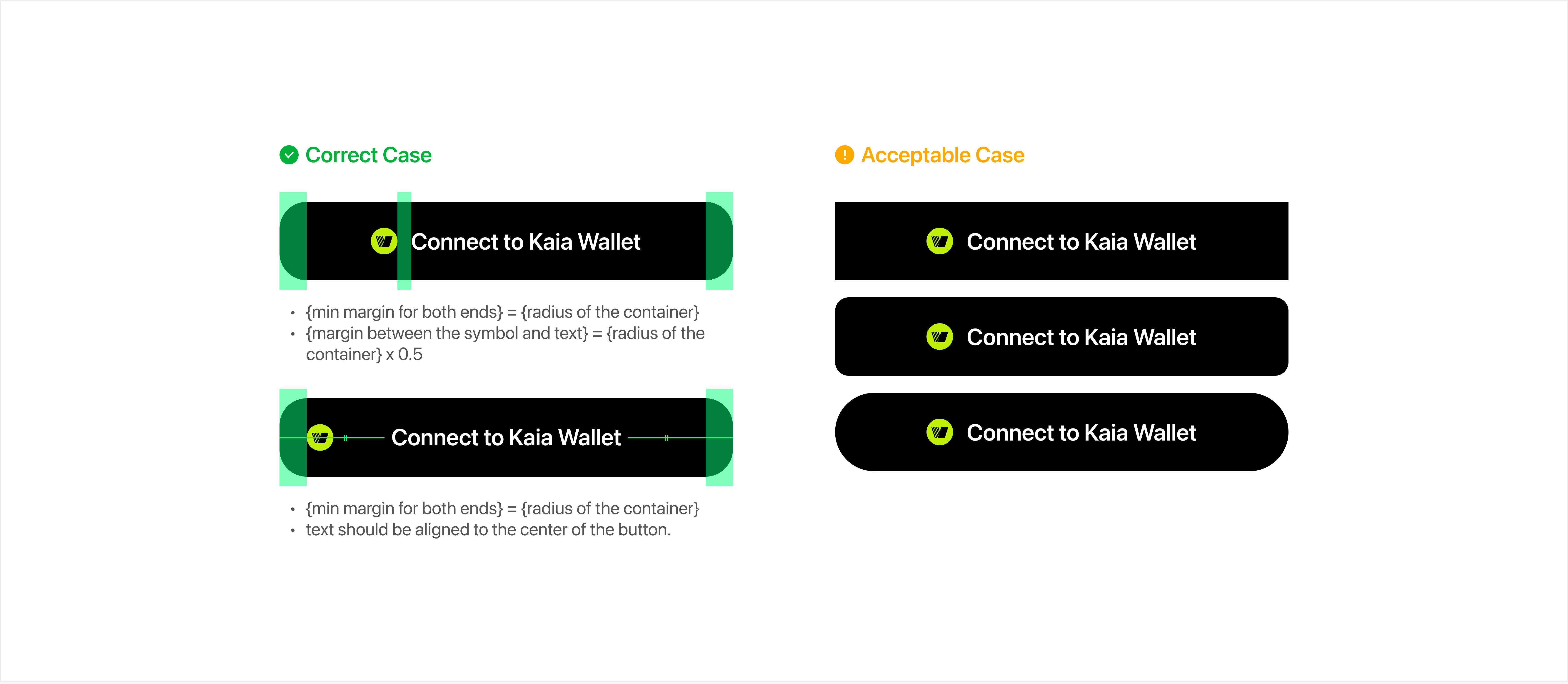
Radius
- The container follows the formula shown below:
- {height of the container} x 0.35 = {radius of the container}
- Although the formula above is suggested, modifying the radius by the screen design is allowed.
Size
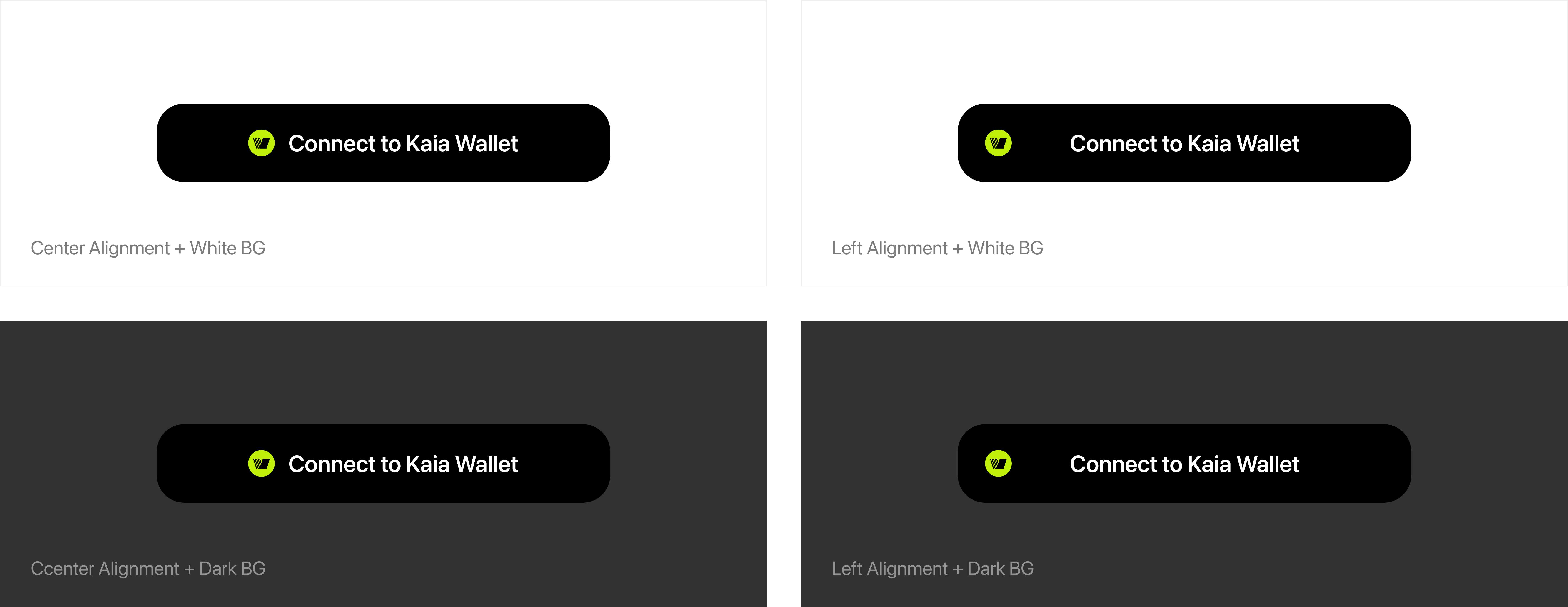
- The container does not have a designated width or height, which can be resized by your design. (However, min-width is 280px, and min-height is 44px)
- You can utilize it with center alignment and left alignment, followed by the guidelines shown below.